
An industrial design, a wonderfully bold medium nib, and the writing instrument I keep coming back to.
There is a difference between owning something you admire and owning something you reach for every day. Sometimes, if you're lucky, one object can tick both boxes. Other times, they serve entirely different purposes.
I absolutely love my brass Kaweco SUPRA. Its construction, weight, engineering, and tactile qualities make it one of my favorite objects, regardless of its intended purpose. But when I'm sitting at my desk and need to write something, it's usually another pen I reach for.
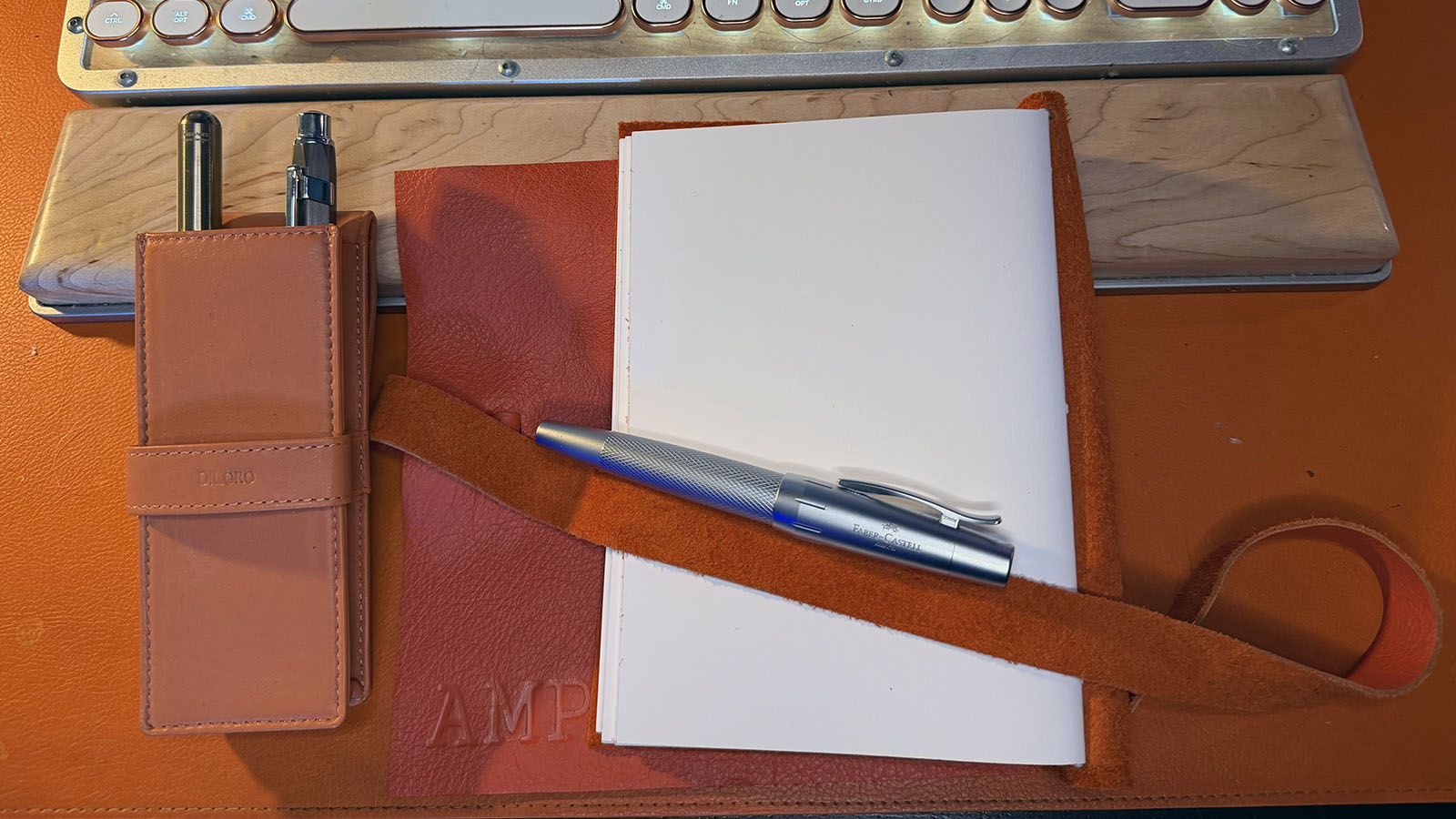
The Faber-Castell e-motion in Pure Silver.
It's a substantial writing instrument with an unusual shape, a beautifully engraved barrel, and a medium nib that lays down an exceptionally rich line of ink. I've owned it for over a year, and despite having other excellent fountain pens within reach, it has quietly become my everyday writer.
There's a reason for that.
A Different Kind of Design
When I started collecting fountain pens, I knew exactly which ink I wanted in my first purchase. The brass Kaweco SUPRA and Diamine Oxblood seemed like a natural pairing. The next pen would be different. I wanted something silver, something that would complement the vibrant blue ink I prefer for business notes and everyday writing.
I also knew I wanted another metal pen. I've always preferred the substance of metal writing instruments over resin. I have large hands, so barrel size and comfort were important considerations. Long before I developed an appreciation for fountain pens, my everyday choice was the Pilot Dr. Grip, primarily because its substantial barrel felt comfortable and easy to control.
That preference led me to the Faber-Castell e-motion.
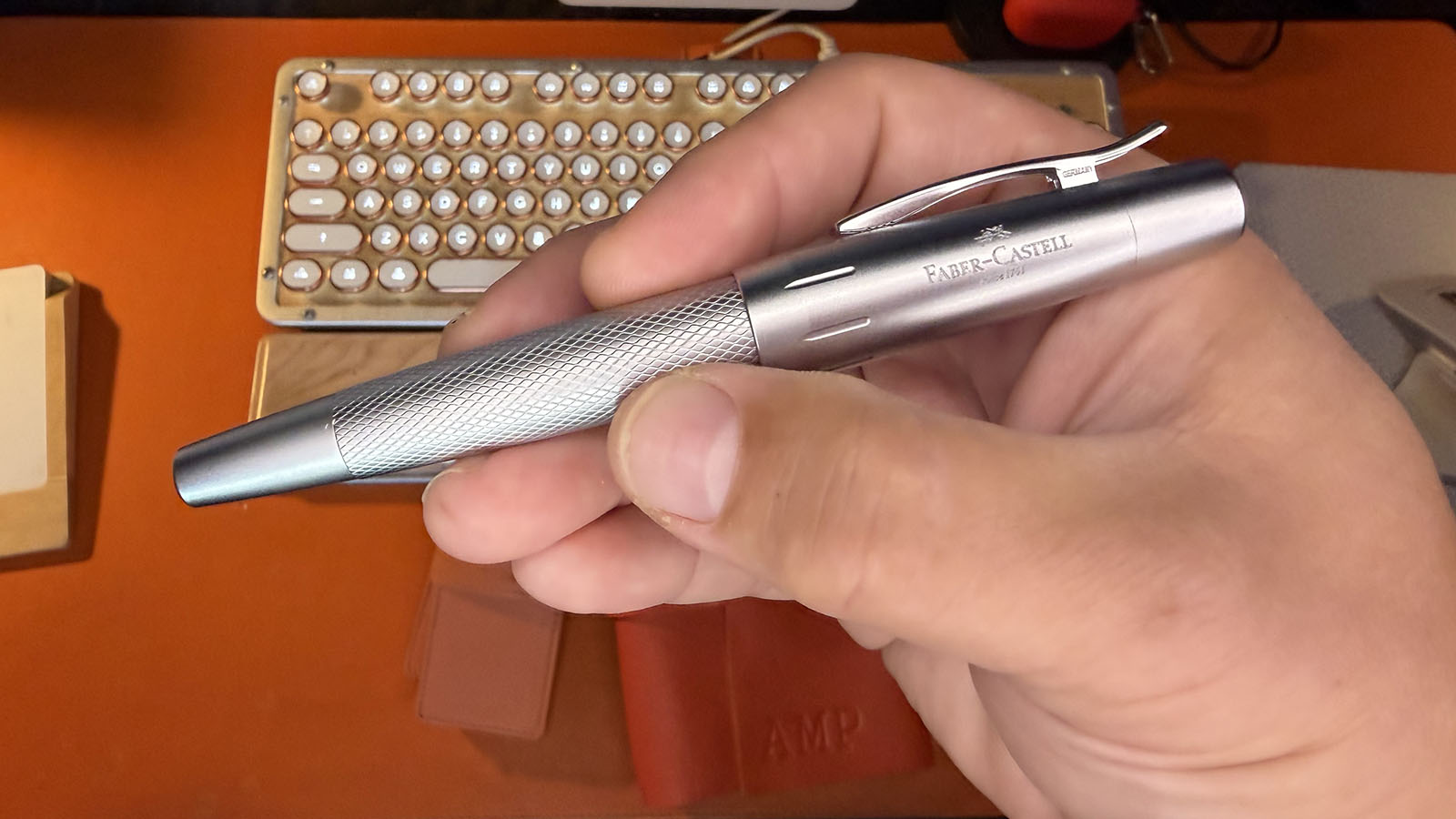
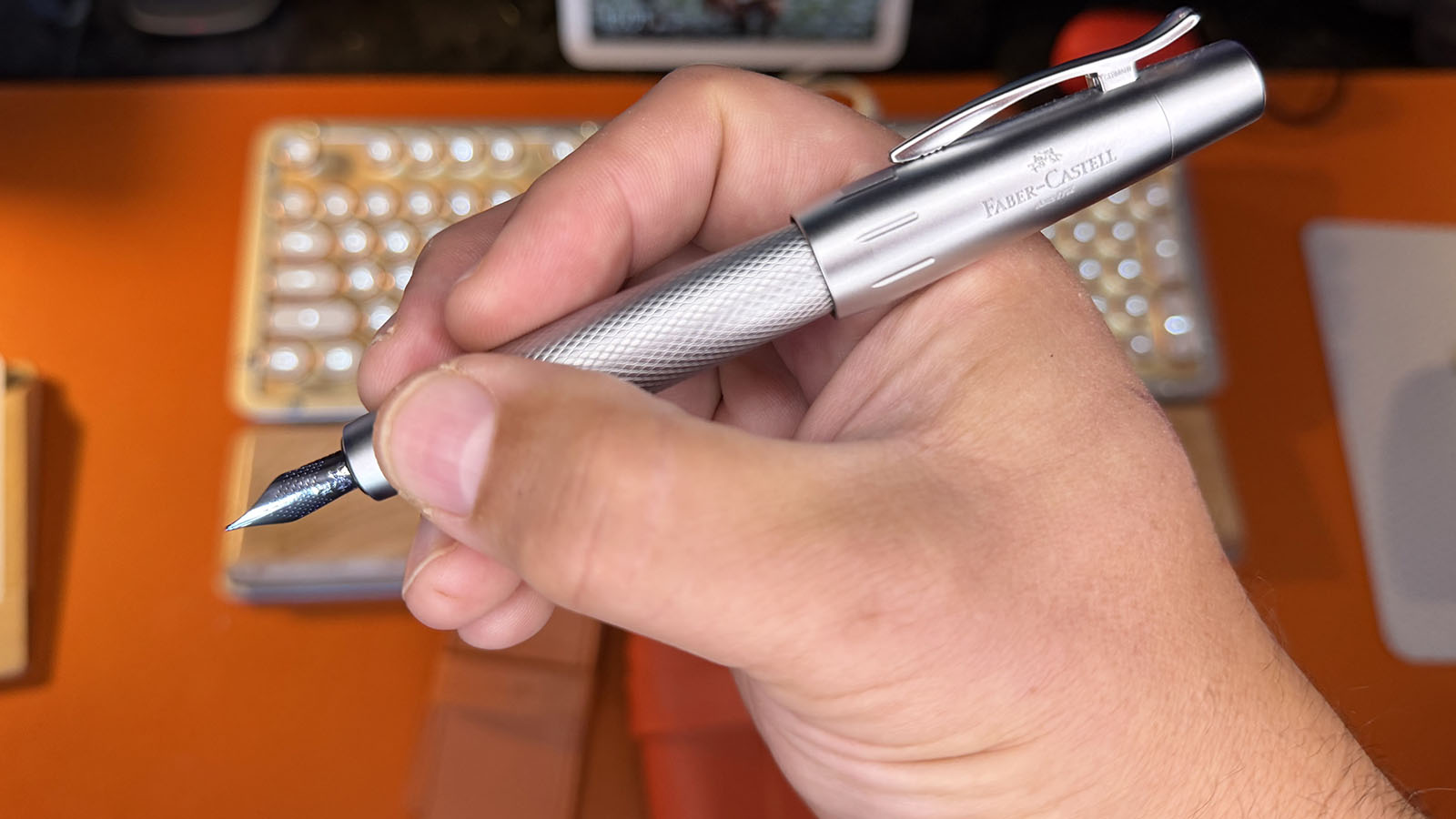
The e-motion has an immediately recognizable silhouette. Its cigar-shaped body tapers toward both ends, creating a short, unusually thick profile that looks considerably different from more conventional fountain pens. The aluminum barrel features an intricate diamond-patterned guilloche engraving, complemented by a matte silver cap and polished chrome accents.
It's an interesting combination of industrial design and decorative craftsmanship. The engraving gives the metallic finish additional depth, catching the light and preventing the monochromatic design from looking sterile. The proportions are bold without feeling awkward, and the spring-loaded pocket clip adds another thoughtfully engineered detail.
Picking it up confirms the impression created by its appearance. At 51 grams uncapped and 73 grams posted, this is a heavy pen. It's cool to the touch and substantial in the hand. Yet the rounded proportions are surprisingly comfortable. The barrel fills my hand naturally, and the weight feels reassuring rather than excessive.
Visually, it's an impressive object. Physically, it's a pleasure to hold.
Weight, Balance and a Wandering Cap
Of course, admiring a pen and actually writing with it are two very different experiences.
The e-motion's wide barrel is particularly well suited to my hands. I don't have to grip it tightly to maintain control, and its weight allows me to guide the nib across the page without applying much downward pressure. The smooth metal grip section initially looks as though it might be slippery, but the flared end helps keep my fingers in position.
Where things get interesting is the cap.
The e-motion is relatively short when uncapped, which gives it a compact feel despite its substantial girth. Posting the heavy cap on the back adds considerable length and dramatically changes the balance. Much of that additional weight sits behind your hand, creating the sensation of a pendulum that takes some getting used to.
Personally, I don't mind it. I enjoy substantial pens, and the e-motion certainly delivers. However, I can understand why someone accustomed to lighter writing instruments might prefer using it unposted.
There is one irritation worth mentioning.
Unlike the Kaweco SUPRA, which has a cap that screws securely onto the back, the e-motion relies on friction to hold its cap in place when posted. You need to push it down firmly. I've occasionally thought mine was secure, only to have it suddenly fly off while I was writing.
A heavy metal cap dropping unexpectedly onto your desk will certainly get your attention.
It's not a dealbreaker, but it's a quirk I've learned to accommodate. I make sure the cap is properly seated before putting pen to paper.
Where This Pen Really Shines
If the e-motion's appearance attracted me initially, its writing performance is what made me keep reaching for it.
Mine has a medium steel nib, paired with Pilot Iroshizuku Asa-Gao ink. That combination is magnificent.
The nib glides across the page with remarkably little resistance, delivering a smooth, generous flow that produces a wonderfully bold line. There is enough feedback to maintain a sense of connection with the paper, but I've never experienced anything I would describe as unpleasant scratching.
And the color!
Asa-Gao is an intensely vibrant blue, and the e-motion's generous ink delivery allows it to make an exceptional impression. Every stroke deposits a rich, saturated line that looks beautiful on the page. I originally purchased this pen specifically for blue ink, but I hadn't anticipated just how satisfying the combination would become.
I've used Pilot Iroshizuku Yama-Budo in my TWSBI Precision, and the writing experience is noticeably different. The Precision produces a finer line and hasn't delivered quite the same consistency as my e-motion with Asa-Gao. The e-motion handles its ink beautifully.
The pen itself is only part of the equation. The nib, the ink, and even the paper contribute to the writing experience.
This is where fountain pens become particularly interesting. The pen itself is only part of the equation. The nib, the ink, and even the paper contribute to the writing experience, and finding a combination that works exceptionally well can completely change your relationship with an instrument.
The e-motion and Asa-Gao have become my favorite example of just how well that combination can work.
Living With the e-motion
A beautiful writing experience doesn't necessarily make something a practical everyday tool. Fortunately, the e-motion performs well in that department, although its unusual design introduces a few compromises.
Filling and maintaining it are straightforward. I use a converter rather than disposable ink cartridges, which allows me to keep it supplied directly from my bottle of Asa-Gao. I've also been impressed by its reliability. Even after sitting unused for extended periods, mine has consistently started writing without hesitation.
That reliability matters when your pen lives on your desk, and you expect it to work whenever inspiration, or an overdue bill, demands your attention.
The spring-loaded clip is another feature I appreciate. It opens easily and provides a reassuringly secure grip, although the pen's substantial weight and unusual proportions make it less appropriate for lightweight shirt pockets or narrow notebook loops.
I generally carry my fountain pens in a leather DiLoro pen case, so portability has never been a significant concern.
Still, this is not the pen I would choose if I needed something lightweight and unobtrusive to carry around all day.
It's much more comfortable in its natural habitat: a desk, a notebook, and a reason to write.
The smooth grip section and heavy posted cap might also prove frustrating for some writers, particularly those with smaller hands or a preference for lightweight instruments. Those characteristics are integral to the e-motion's design, and whether they're advantages or disadvantages will largely depend on personal preference.
For me, the combination absolutely works.
Different Pens, Different Personalities
My fountain pens don't have strictly assigned jobs. Instead, each has its own ink color, and those colors naturally lend themselves to different purposes and moods.
The Kaweco SUPRA carries Oxblood, an appropriately rich color for a brass pen with so much character. My TWSBI Precision has its own place in the collection with its dark, eggplant-hued Pilot Iroshizuku Yama-Budo ink, while the silver e-motion houses the vibrant blue I reach for most often.
I never particularly deliberated over those pairings. Each combination simply felt right.
What I find interesting is that my admiration for the Kaweco hasn't diminished simply because I use the e-motion more frequently. The SUPRA remains an extraordinary piece of engineering, something I enjoy handling and examining as much as writing with. Its modular construction, beautifully machined brass, and securely threaded cap distinguish it from almost everything else in my collection.
While the Kaweco might be my favorite fountain pen as an object, the e-motion has earned the position of my everyday writer.
The e-motion offers something different. It's comfortable, dependable, and exceptionally satisfying to write with. When I need to leave myself a note, write a check, or spend some time putting thoughts onto paper, I find myself reaching for it almost automatically.
In other words, while the Kaweco might be my favorite fountain pen as an object, the e-motion has earned the position of my everyday writer.
There's room in the world for both kinds of appreciation.
Finding the Right Combination
After more than a year of ownership, I wouldn't hesitate to purchase the Faber-Castell e-motion again.
That doesn't mean I'd recommend it without qualifications. It's a particularly heavy instrument with unconventional proportions, a smooth metal grip, and a posted balance that some writers will find uncomfortable. If you're looking for a lightweight pocket pen that practically disappears in your hand, I'd encourage you to explore other options.
But if you appreciate substantial writing instruments, have larger hands, or simply enjoy the sensation of a heavier pen guiding itself across the page, the e-motion deserves consideration.
Its appearance is distinctive, its construction feels substantial, and its medium nib delivers a writing experience that keeps me coming back. Paired with the right ink, it's a remarkably satisfying everyday companion.
And perhaps that's what owning this particular pen has reinforced for me. A good writing instrument doesn't necessarily need to be perfect or excel at everything for everyone. It needs to excel at the things that matter to the person using it.
For me, that's the comfortable, hand-filling design, dependable performance, and spectacular combination of a generous medium nib with vibrant blue ink.
My collection will undoubtedly continue to grow. In fact, I've already started thinking about my next purchase: something black, paired with a gunmetal or steel-gray ink. I've never been particularly enthusiastic about writing in black, but gray is another story entirely.
Whatever comes next, I suspect the e-motion will remain within easy reach.
After all, when something makes the simple act of writing this enjoyable, why would I put it away?
Latest From Style & Substance
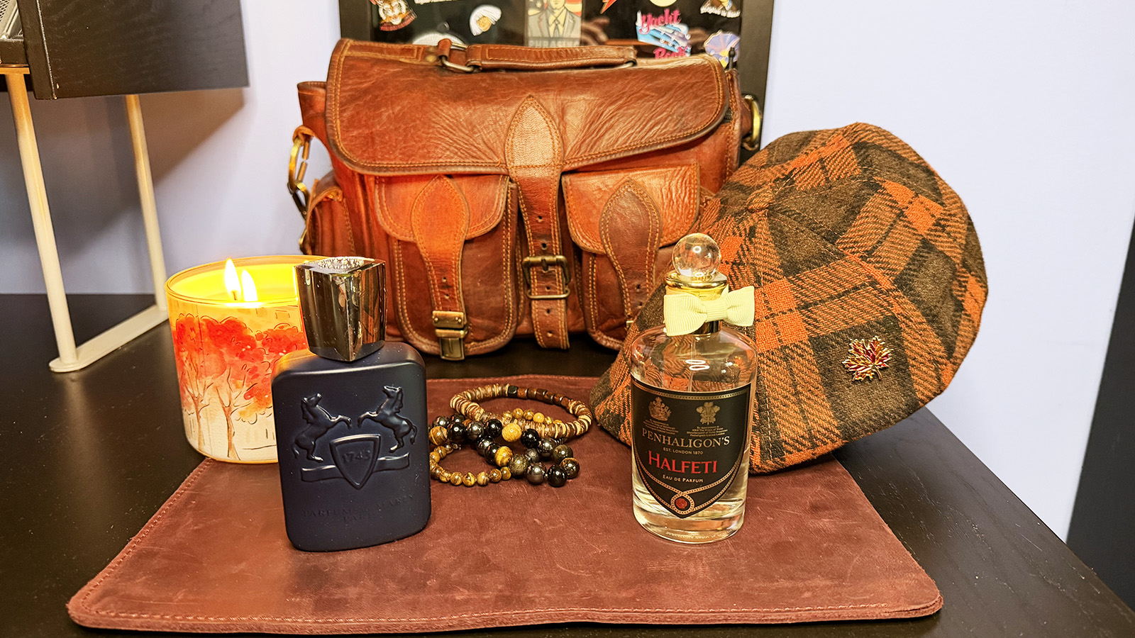
Two Fall Scents, Done Right
Two fall fragrances, two very different moods. Layton brings warmth and ease; Halfeti brings depth, structure, and cold-weather drama.
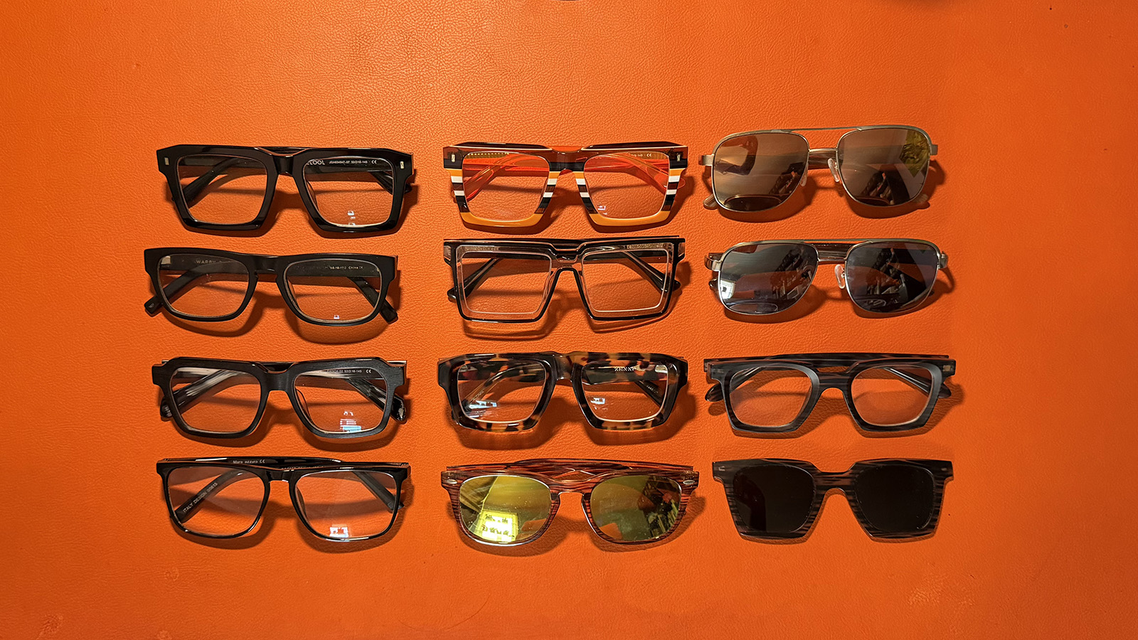
The Case for a Wardrobe of Glasses
Cheap glasses changed more than the price. They turned eyewear into part of the wardrobe, with room for color, risk, and personality.
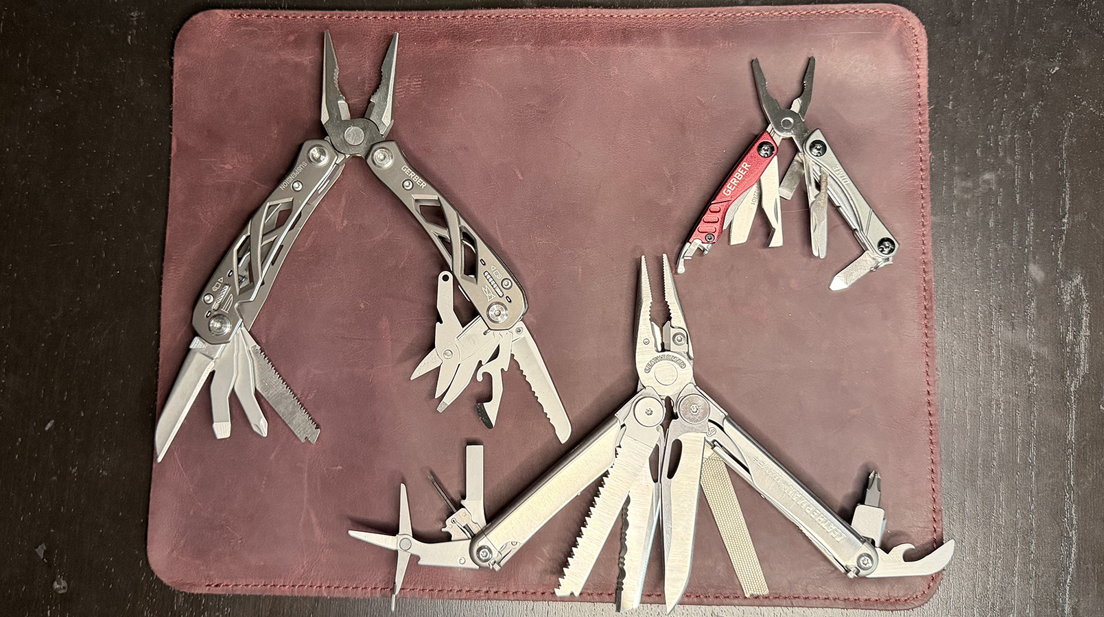
Three Multi-Tools, Three Different Jobs
Three multi-tools, three different jobs: a desk-side workhorse, a tiny travel companion, and an old favorite still earning trust today.